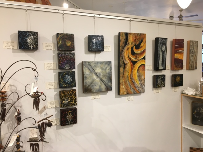
Last night was Members’ Night at the gallery – an annual event offered only to members in which all merchandise is offered at a 10% discount…this one night only. The gallery was closed for a week so that we could send much of the old merchandise back home with their artists and bring in their new stuff. Shelves and walls are almost all mobile so the configuration of display space changes as well. The gallery looks different and fresh and exciting. Scott volunteered with me last night and we had a great time.
I was given a mobile wall and am pleased with how it looks.
I made a bunch of “six inch quickies” to see if there’s any interest. If so, great. If not, I’ll paint over them.

I also tried making a series called “Indigo Moods” but I only managed one with the time I had.


The idea is was to put several layers of indigo on the panel, then fuse an off-white square on top and etch through it to get to the indigo but the layers of white were too thick. I was going to try etching an image similar to the photo shown with the three panels but it didn’t work, so I ended up scraping off much of the white and started playing with just the two colors and “Moon Rising” (right) developed. I’d like to try a few more panels using just the two colors. I’m such an indigo slut – I use it prodigiously and unapologetically.
“Bristlecone Pine” makes me happy.
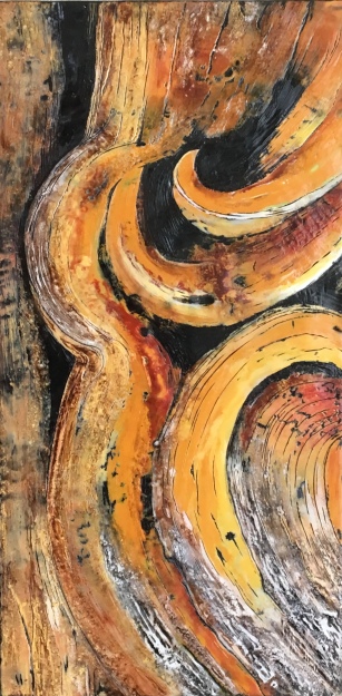
It could also be turned 90 degrees to the right and be okay for me. This 26″ X 13″ painting started off very freeing – long, flowing ribbons of color atop a charcoal black base. When the proportion looked alright, I started etching into the color through to the base. Starting with a very dark base created great depth. To get the light and dark mottled effects, I dipped my brush into molten wax and let it cool briefly before applying to the board. This created a highly textured surface into which I rubbed black, raw umber or burnt umber. Then I fused it. Upon cooling, I strategically scraped the surface creating high contrast and lots of interest.
Also completed for the show:


“Very Cherry” on the left. “Weathered #3” on the right. “Very Cherry” was not looking good for a long time. I had tried inserting terra cotta pot shards which looked gawd awful, but when I removed them, pottery dust was left behind which looked good I thought. So I just added gouges and pigment and that was enough to satisfy me. And I wanted some depth and a horizontal appearance on the bark to replicate the striations on cherry bark, so tried to achieve that with color and scraping. The surface is very smooth and shiny, except for the “lenticels”, which is as it should be. It’s fine, it’s graphic, it’s colored vibrantly and, best of all, it’s done. “Weathered #3” is a made-up piece based on a memory of a white (larch, I think) picnic bench at Bates State Park in eastern Oregon. My mind imagined other colors added – periwinkle, creamsicle orange, brown for depth and indigo (slut!) for a little drama. Again, it’s fine and it’s done.
My babies of the bunch, however, are “Opposite Attraction” and “Spanning Generations”.


I really love the limited palettes of both and will be equally happy if they sell or not. Part of me hopes I’ll have them forever.
